Showing posts with label color. Show all posts

Saturday, February 7, 2015

Safe Harbor, Part 1: Gathering Story Elements


This April, Chris Ryniak and I have another two-person show at Stranger Factory. Because we both have a background in design and art direction, we tend to go a little crazy with theming, but I wouldn't have it any other way, honestly. I tend to be extremely thematically-inclined with my own bodies of work, and it's very comfortable to work with another artist who feels the same way.

The first part of the theme that we come up with is the "story" of it - what will the body of work be about? For this show, we chose the title "Safe Harbor". As you can probably guess, it is nautical in nature. Not even just the sea, but ideas, objects, and history that surrounds it. You can expect to see a lot of marine motifs in my work - shells, crab claws, coral, scales, as well as more dockside elements such as fishhooks, anchors, baitfish, and flags.  We're wanting to more or less be able to represent two worlds of the sea; the world underneath the waterline, and the world that sits right on top, relying on the bounty of the ocean for sustenance.

After we've got our story down, we immediately go into picky designer mode and come up with a color palette that will govern the entire show.  If I'm making more than 3 pieces at any given time, I pretty much always choose a palette for the work. I feel so much more comfortable working within color parameters; even if a piece does not specifically fit into the story of the rest of the work, it will visually harmonize if it fits within the color scheme. This is important when we need to fill an entire gallery.


The palette we came up with is a wash of salt-bleached neutrals bolstered with bright pops of saturated color. Sand, pebbles, driftwood, and worn canvas sails. Peeling yellow paint on a time-tested fishing boat. The brilliant aqua of equatorial seas and the faded blue of storm-greyed skies. Rusty-red coral, nacreous abalone, and patinated copper and brass.

Now that we've defined these things, it's time to get to work! There are patterns to be cut, faces to be sculpted, and mermaids to design. More sneak peeks to come, as there is so much more left to do!


Sunday, March 16, 2014

Week in Photos: March 16, 2014

Apologies for the lack of blog updates this week...I've been rushing around doing a bunch of domestic life things that have little to do with art, so my updating has been a little thin. There will be more soon :)

Sat and assembled a bunch of Dumblebee charms, that will be
available in my shop soon.

Speaking of shop, I revamped the online store! It's all spruced up
and ready for sales...there's nothing in it yet, but if you'd like to look around,
you can find it HERE.

Got to play with ALL the glitter colors!
These are going in resin Pipsqueaks...

Sculpted and primed a handful of faces...

Monday, March 3, 2014

Show Color Palette: Forgotten Finery


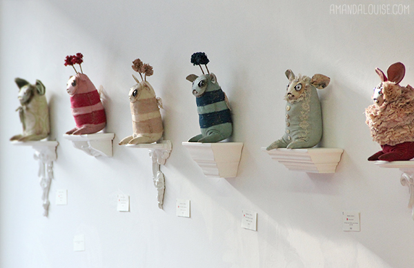
Back in the spring of 2012, I had my first-ever solo exhibition (sold out!), called "Forgotten Finery" at Rivet gallery in Columbus, Ohio. This show marked the first time I took a decidedly "lighter" approach to a body of work, as many of my previous shows had featured darker colors, a more "decay" oriented aesthetic, and a slightly more sinister feel. I wanted to explore my work as a form of decoration, and approach this particular group of dolls from a brighter and warmer perspective.

The main source of inspiration for this show was Rococo art and fashion (I even made a nearly 3-foot tall bunny in a layered Rococo-style gown). It exemplifies this sort of "opulence of privilege" that exists purely as a fantasy for most people, attainable for very few.

Some inspirations included:

• the incredible fashion (for both men and women of the high classes) of the late 18th century, with hand-tatted lace, shimmering silks, matte velvets, and hand-embroidery.

• the soft, buttermint colors of tea roses and peonies

• exquisite (and often inedible-looking) wedding cakes, French pastries, and confections

• The lore and speculation surrounding the life of Marie Antoinette. I read a couple of biographies about her during my time working on the project. I also watched Sofia Coppola's film "Marie Antoinette" numerous times as well - while not a historically accurate depiction, the art direction and costuming are endlessly inspiring to me, still. Every frame, it seems, contains at least one very good artistic decision.

• the stiff and lovely costume of classical ballet

• block-printed wallpaper, from the 18th century


My "Duchesse" for the show - freestanding at 30" tall!

I even ensured that the refreshments at the opening fit the color scheme!


Thursday, January 30, 2014

Show Color Palette: Migration


This is a small series you'll see pop up on the blog once in a while - about the color palettes I choose for my shows, or groupings of work.  I love color - I LOVE IT. Though I clothe myself in black and live in a home full of time-worn neutrals, I use a lot of color in my work. Color can communicate ideas and themes that words, textures, or other visual cues cannot, and it's just pure aesthetic pleasure to combine them and see what happens.

I worked for almost 9 years as a commercial artist and came up with color palettes on a daily basis. I know I always thought in terms of color groupings, but it wasn't until it was a part of my career that I realized I literally cannot begin a group of work comfortably unless I had decided on a solid palette to work from.

Migration (my show with Chris Ryniak, that showed at Stranger Factory in March of 2013) explored themes of moving, traveling, and self-sufficiency, with a rich, earth-pigment color selection to accompany it.

Some of the influences for my pieces were:

• Tibetan prayer flags, shredded by wind and faded from the sun
• Mongolian nomads - their dress, tents, and lifestyle of constant movement
• Explorers and early discoverers
• the colors and textures of rocky, unforgiving places - the desert, the mountains, cliffs, and caves
• Driftwood, river stones, spools of hemp rope, worn leather
• Aged, dented, metal - temple bells, buckles, nails, and ancient jewelry
• Huge sacks of spices and herbs at open air bazaars
• The smell of burning wood, incense, and sacred oils

We worked together to finalize the color palette, so that it would be cohesive for the show, but still allow both of us to utilize the colors in a way that worked best for both of our different styles. Both Chris and I are designers, and both agree on the importance of a strong color statement across every single piece in the shows we do. We reinforced the palette in our show signage, using painted cardboard letters in various colors, that hung on the wall above our biggest piece:

Migration opening night, March 2013. Picture courtesy of Sara Harvey's Flickr Photostream.
Because we were so diligent in keeping the colors a prominent design element, the show held together very well, even across the walls of a large gallery. Creating a sense of "theme" is a huge passion of mine, and I look forward to every new opportunity I get to do so.

Thursday, July 5, 2012

Inspiring Objects #3

1) vintage giant safety pins, 2) Composition book belonging to Mrs Adolph Pasternak, 3) Mrs Winslow's Soothing Syrup bottle, 4) Explication du Tableau book, beautiful foxing inside, 5) Citrine crystal cluster
*side note: I just discovered that Mrs. Winslow's Soothing Syrup contained a high dose of morphine sulfate. Little wonder it was so soothing!

Wednesday, June 6, 2012

Inspiring Objects #2

1) Sketchbook from Delfonics, Tokyo 2) Fuchsite specimen, 3) China Glaze "For Audrey" nail varnish, 4) vintage enamel buttons, 5) vintage glass rhinestones

Tuesday, June 5, 2012

Inspiring Objects #1

I'm going to periodically post an "Inspiring Objects" series.  Just things in my everyday life that I love and/or find interesting. Hope you enjoy.

1) Peleda wind-up owl by Nathan Jurevicius, 2) Rose quartz, 3) vintage hand-tatted French lace, 4) printed fabric from Okadaya, Tokyo, 5) Cherry flavored mochi, 6) Boots' hand cream, 7) Sakura jam from Takayama